
FAY Basis Design Information
Lorem Ipsum Dolor Sit Amet
About
I started attending design school in late 2020. This was without a doubt one of the best decisions I had ever made. I started learning about the topics I had previously only educated myself via YouTube, got to know other like-minded designers, and received guidance from experienced teachers. To me, this felt like a whole new world and inspired me to take this opportunity as seriously as I could.
Part of the curriculum was a class about typography. It was one of the most influential experiences I had as a student, despite the class only lasting half a year. It covered everything from the anatomy of the letterforms to the correct usage and design rules of type itself. However, due to time constrains, the one thing it didn’t cover was what it would actually be like to create a typeface from scratch. As dedicated as I was, I knew that if the class wouldn’t teach me how, I would fulfill that wish myself.
Don’t get me wrong though, I absolutely loved my teachers. Throughout the years, while I was working on projects, they supported me with lots of advice and encouragement, even outside of class hours. One piece of advice my typography teacher gave me when discussing the project with her was: “Creating a typeface is the work of a lifetime”, and while at first I only half understood what this truly meant, it really has aged like fine wine.
Naturally I didn’t start out with a typefoundry or even the wish to make more fonts than the one I had been working on. It was simply a creative exploration I wished to pursue, after learning so much about typefaces and how to use them. Looking back, it really is amazing how one small change can change your entire life in the long run. In this writeup, I’d like to talk about the process behind this typeface, my inspirations and thought process along the way.
In the end, after 5 years in development, FAY Basis is the first typeface released by FayType. Starting as a personal workhorse, this versatile neo-grotesque type family is inspired by iconic design history, and has since seen every version of scope creep and creative overhaul imaginable. On one hand it was a wonderful experience to develop and publish a typeface, on the other hand the process has made it difficult to actually define what FAY Basis is and what problem it’s meant to solve. In the end, FAY Basis is the reason FayType exists; the very basis of it, if you will.
Inspiration
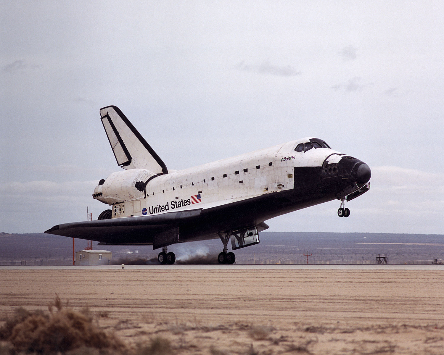
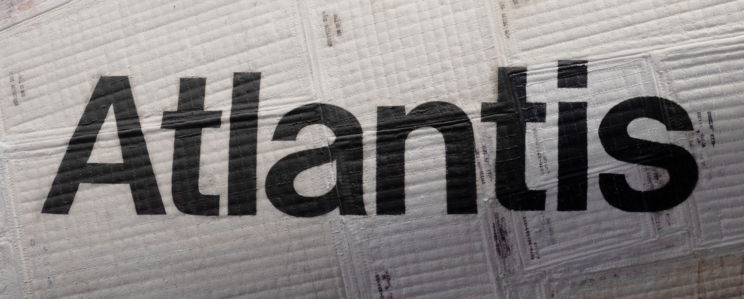
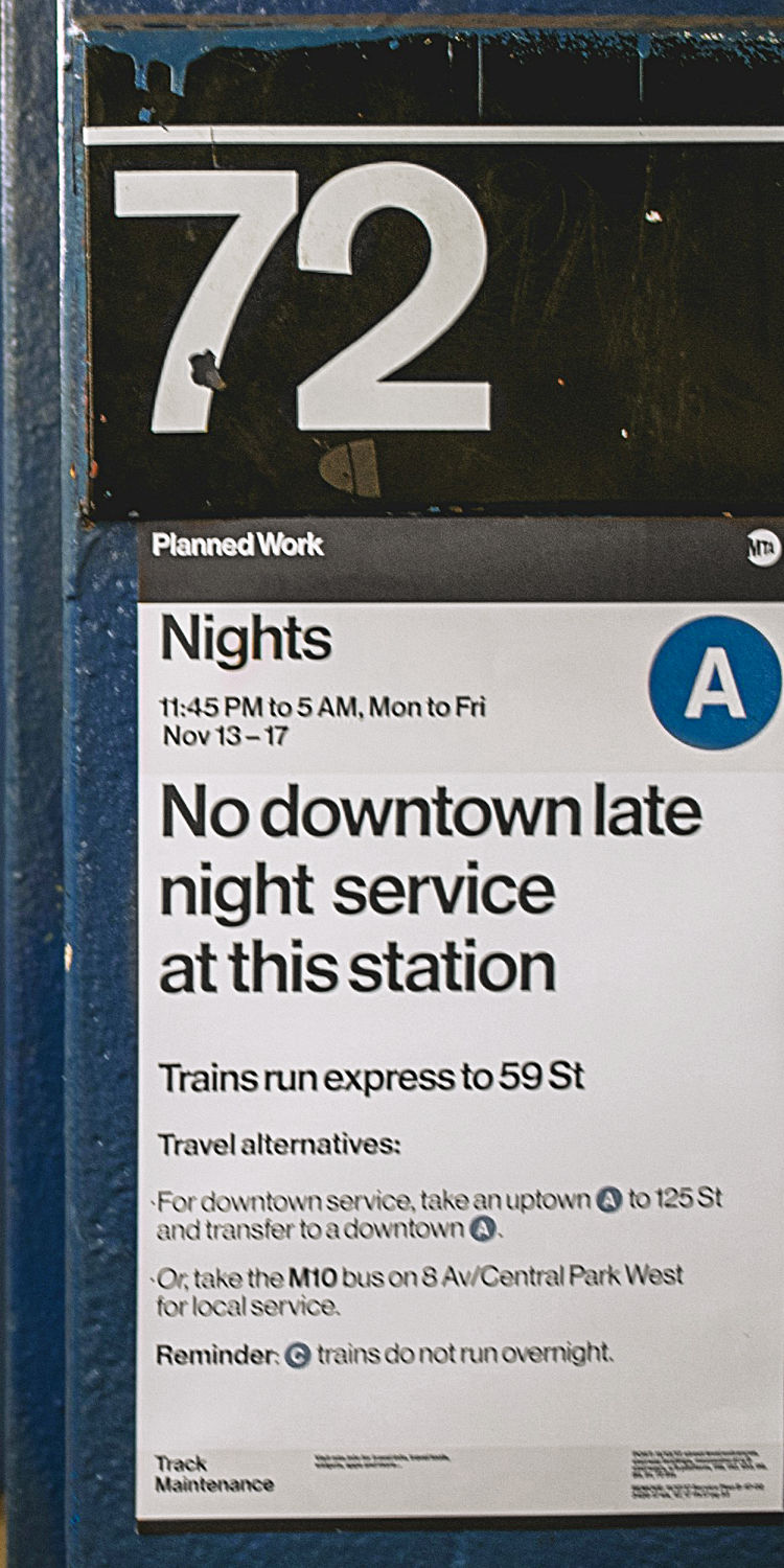
There is one thing that’s certain: FAY Basis is inspired by the graphic design history I’ve grown up with. Even before I started to create typefaces and was just working as a graphic designer, I was mesmerized by the influential projects celebrated by designers, such as the Space Shuttle Program or the NYC Subway Signage System. These projects and the way they’re talked about in design media exert professionalism. A sense of significant impact, something that has left its legacy.
I was a young designer trying to find my place in this world. Struggling with the realization of growing up and being uncertain about my skills as a designer, the professionalism and security of these projects served as an anchor to ground myself with. The structure and cleanliness of the visual language of the International Typographic Design style and its offsprings eventually formed a blueprint for me to follow. I wished to create something that referenced this feeling of awe I had gotten, yet also something that was made by me, something that I created. I wished to create my own Helvetica. Not to try and improve one of the most appreciated and discussed typefaces, simply my own interpretation of what Helvetica means.
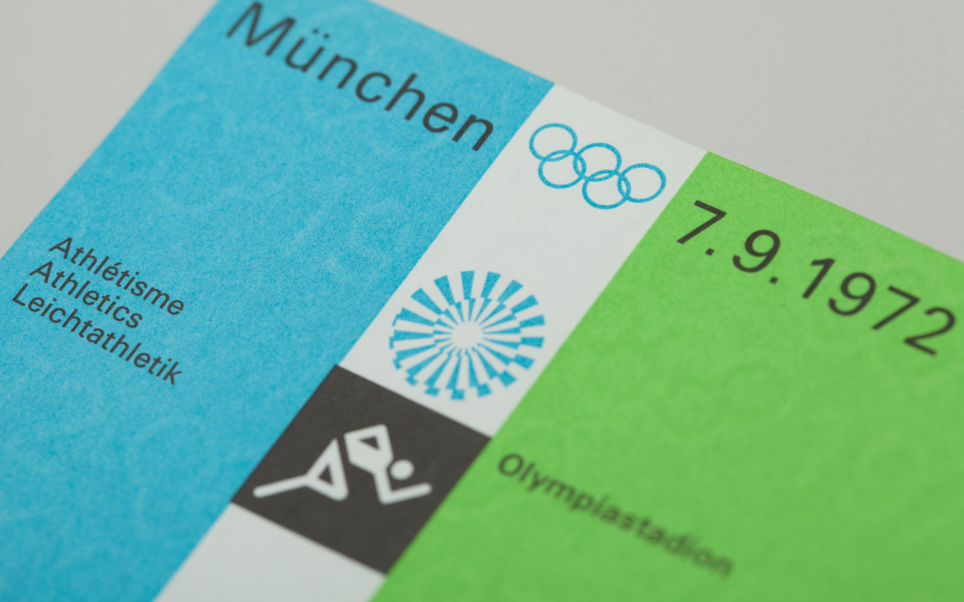

The typography of the projects in the Swiss Type Design Era simply amazes me. Helvetica, Akzidenz-Grotesk, Univers, Folio, etc. The bold weights, tight tracking, the simple letterforms suggesting professionality and modernity while also carrying a feeling of legitimized history. It just works. It gives me a feeling of anemoia, of a time before crypto scams, SaaS subscriptions and engineered algorithms attacking every second of our time. When bright-minded people and artisans practiced their craft and created things that would last. Perhaps I’m a victim of cherrypicked and romanticized examples that don’t accurately reflect the impact these pieces actually had in their time, but the impact these design styles left cannot be overstated. After all, the priniples established by the Swiss Type movement are fundamentals we still work with to this day.


Probably the best example of this professional inspiration I can share comes from advertisements by the company Braun. I have a lot of respect for Dieter Rams, who was the head of (product) design for Braun from 1961—1995. I recently saw an ad for one of their products on social media, which I found quite appealing. The solid colors, clear key visual photography, the use of their own minimalistic sans-serif brand font, "Braun Linear" by iconwerk, and minimal layout with focus on the basics, exudes professionality and confidence in their work.
Similar things can be said when looking at an old, printed advertisement for another Braun razor from decades earlier (1963). It uses same simple concepts such as effective hierarchy, a grid based layout and clear product photography. The cherry on top is their use of Akzidenz-Grotesk, which completely connects this work back to the design style I'm so impressed by.
Taking a step back and admiring the change of their visual design style over the years really underlines the fondness I have for this era of design. The mediums changed, we went from premade lead type to a custom-made vecor-based brand font, from printed ink to digital pixels, and yet the core message remains.
All Purpose Font
As a young designer on social media in the late 2010s/early 2020s, creating and showing off your own visual identity was among the biggest trends there was. Logo variants, brand colors and typography all placed into a neat graphic to post on Twitter and Behance. Specifically for the brand typeface section there were a few things to consider. The typeface had to be free for commercial use and feature multiple styles in order to allow for a wide range of use cases. In my recollection, this was before Inter became the go-to font, and most designers ended up choosing Montserrat or Poppins.
I have always been a fan of making things myself. It’s definitely not the perfect way to go about it since this brings many disadvantages, but to me as a graphic designer it felt unfulfilling to design part of my visual identity myself, but to also not have complete creative control over the appearance of the typeface, the part that makes my message readable. I understood that the level of quality of a beginner would not be on the same level of refined typefaces made by expert type designers, but it would be something that I had made, reflected me on a personal level and could always improve it down the line.

Balancing Perfectionism
FAY Basis went through multiple iterations, having been reconceptualized and -drawn from the ground up about 3-5 times. Setting aside the common difficulties and pitfalls that come with learning a new skill, the concept behind the typeface itself was adjusted multiple times. Each iteration improved on the balance between the organized, perfect precision and having a usable typeface.

FAY Basis was designed with the feeling of big headlines and signage in mind. It was important that letterforms lined up in order to look appealing when at a large scale and spaced very tightly together. However, leaning too much into this would’ve restricted part of the original brief of having a usable all-purpose typeface. In the end, FAY Basis became a multi family typeface, featuring a Display and Text family, each featuring 7 regular and 7 oblique weights for a total of 28 styles in the typeface family at this moment.

The Display family is optimized for headline uses, having tighter spacing and kerning, a shorter descender, and having more letterform parts that align when using the typeface in display or headline sizes. The Text family focuses on keeping the spirit of the typeface, while providing optimizations for usability at bodytext sizes.

One such example is the (shoulder? ear? terminal?) of the lowercase /r. In traditional typefaces this part of the letterform is increased in height compared to the other horizontal crossbars in order to compensate for the negative space created by it when read at small sizes. In the FAY Basis Display family the /r is aligned with the crossbar of other lowercase letters perfectly, while the Text family has the optical adjustment other typefaces have.

FAY Basis has many similar adjustments to align the letterforms when viewed at large scales, such as the curved terminals ending on x-height, or aligning the horizontal crossbars.
90 degree angles
Helvetica especially stood out to me originally because it possessed an extremely important identifier compared to other typefaces that were known to me at the time, the 90 degree terminals. This was an absolute requirement for FAY Basis as it would give the typeface another layer of organized design, as angled terminals (disregarding their valid uses) simply didn’t fit to my vision of having a visually appealing alignment.
The original base letters worked well, as the concept has already been proven to work. As an extra step, my goal was to also have the terminals line up with each other as well in order to strengthen the alignment factor.

One of the major decisions I had to make was regarding the size of the aperture of the /c. The goal was to have the terminal stokes of various letters line up, such as /a, /c, /e and /s . In order to allow for the alignment of the terminals, the letterform was quite open, which unfortunately made the grey value of the glyph a lot lighter compared to the others. I’ve tried to find a proper solution for well over a year. After dozens of iterations, plans for stylistic sets and more, in the end I settled on keeping the aperture of the c tighter to support the display purpose the typeface has.

There was one more glyph in the creation process that gave me more headaches than any other; the asterisk. Having found success with the base latin characters, I wanted to keep going and continue to give each letterform a 90 degree terminal, in order to keep the spirit of the typeface. Every reference, every specimen has deviated from the usual design of the letterforms and made it match the default that has been established. Due to the general star shape of the letterform itself every 90 degree terminal attempt looked off, since it didn’t adhere to the general conformity the letter has. It’s taken years, but this was the glyph where I had to accept defeat. While I tried to make every letter “look perfect”, it was exactly this that stopped me from designing a glyph that was stopping me from doing it.
Arrows
Lastly, another design detail I’d like to cover are the arrow glyphs of FAY Basis. The usage of the bold iconography on the various signs are among most recognizable features of the NYCTA Design System. As FAY Basis is inspired by iconic graphic design history, when designing the arrow glyphs, as well as other symbols, the goal was to capture the essence of those very same icons, that have been inspiring designers for generations, including myself. For FAY Basis, the arrow glyphs have multiple variations and features, in order to respect the origin of its inspiration.

The main usage problem I saw while experimenting with creating symbols was the different look, or alignment rather, an arrow would need were it to be paired with a lowercase vs an uppercase writing style as the center of weight shifts between the letterforms. FAY Basis allows you to change the case of the arrow glyphs, letting you pick between uppercase and lowercase variants, which are centered appropriately.
Similar to how we have hyphens, em/en-dashes and underscores for varying grammatical purposes, I also thought about giving the typeface family more options for the arrows themselves. Short arrows could be used as icons, whereas long arrows are often used to convey a sense of progression. In order to expand on the ability to use the arrows, I made different arrow versions of varying lengths. They can be easily created manually by following the ligature recipe above. The ligatures are available for left-, right- and both-direction-facing arrows.
As a final customization option for the arrows, FAY Basis features two Stylistic Sets featuring circled and squared shapes. The inspiration for the design of the sets once again comes from the NYC subway signs. Setting the arrow shapes into the negative and letting the main shape control the form, each with their own shape language, gives the icon another way to stand out from the regular flow of text.
Closing
It has been just about 5 years since the conception of the idea behind FAY Basis. So much has happened, so much has changed, it feels unreal. I am far from the same person I was when originally starting this project. What started out as a simple personal brand font, ended up as the foundation of a new obsession, a new passion, a new way of life.
I think it is always good to have a little moment of self reflection at the end of each design project, debriefing yourself about the process, what went wrong or right and what to do better next time. The one thing I am the happiest about is the fact that the essence of FAY Basis stayed true to it’s early plan, despite the changes that happened along the way. I feel like the “me” that started this project 5 years ago would agree with FAY Basis being an accurate result of my inner vision back then. I do feel some sort of pride in that.
I wish to give a huge thanks to my teachers at the design school I attended, especially Mr. D and Ms. F.
Furthermore, I’d like to thank Fio Gonçalves, who served as a type design teacher early on and Rutherford Craze from Mass-Driver for providing me with nothing but support, encouragement and advice along the way.
I couldn’t be more grateful to all of you. From the bottom of my heart, thank you.
I can’t wait to expand on the knowledge gained, especially with future FayType projects. Creating typefaces is the work of a lifetime, after all.